
Welcome back! Last
week, I corrected a trifecta of misconceptions about the heraldic
design located just above the arch of Sleeping Beauty Castle, and
went on to explore some of the other instances of medieval heraldry
used for thematic and decorative purposes in Fantasyland. This
week...the latter continues!
We
left off at the King Arthur Carrousel, which is appropriately
decorated with the armorial shields traditionally attributed to some
of the Knights of the Round Table, albeit with some odd color
substitutions. Immediately to the east of the Carrousel is an example
of very non-traditional
heraldry:
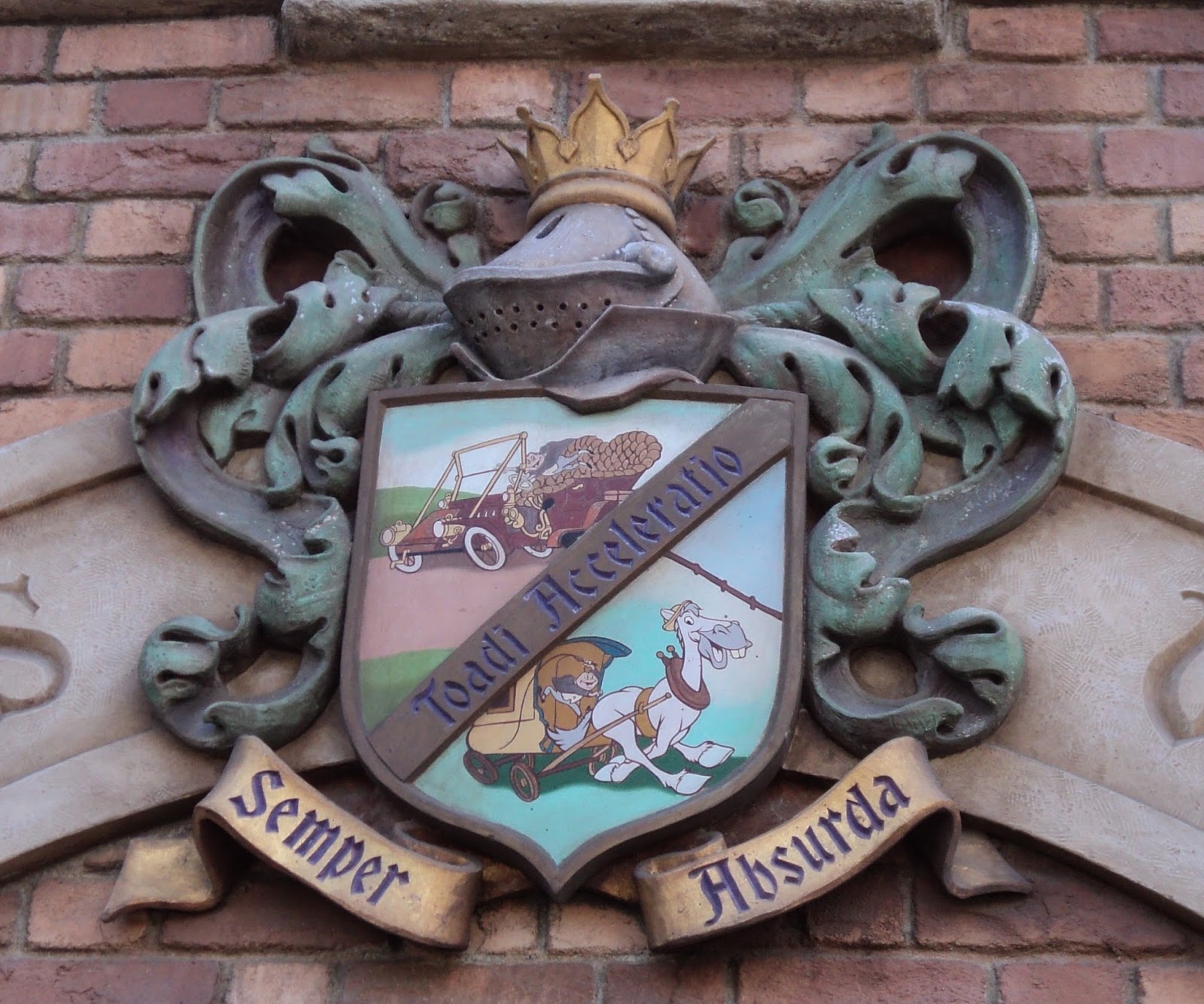
This is probably the second most prominent coat of arms in
Disneyland, and it could scarcely be more different than the one on
the front of the Castle if that had been the primary purpose of its
design. The most seasoned heraldry expert in the world would be
hard-pressed to blazon (describe in heraldic jargon) this thing.
Besides the use of elaborate, full-color cartoon images as charges,*
I've never heard of a motto being arranged with part of it on the
shield and part beneath like that, and the helmet appears to include
an Eton collar. However, at least the helmet is presented correctly
for a gentleman of Mr. Toad's rank, and the Imagineers responsible
for the design have made an excellent, if obscure, visual pun by
patterning it after the tilt helm of Renaissance tournaments...also
known as the “frog face.”
Our
next exhibit will be a bit of a walk from here, but it might be the
most important one yet. It's certainly the most accurate
one in that most of the shields on display at this particular
attraction represent identifiable coats of arms that are still in
everyday use! The attraction in question is the Matterhorn Bobsleds,
and you've probably noticed these before:

The
big central one is obviously the Swiss flag in shield form, and if
you guessed that the others also had something to do with
Switzerland, you'd be absolutely right. These are the arms of 18 of
the 26 Swiss cantons (member-states), and some of them date all the
way back to the 13th
Century! If you're deathly curious about which arms go with which
cantons, Wikipedia—as
usual—has your back.** More shields can be found lining the
switchback portion of the queue under the chalet roof...although to
the best of my recollection, not quite all the cantons are
represented. If nothing else, Jura is absent because it has only
existed as an autonomous state since 1979—20 years after
the Matterhorn was built. I believe Schwyz is also omitted, perhaps
so it won't be mistaken for a really badly executed coat of arms for
Switzerland itself.
But wait, there's more! The safety gates in the load and unload areas
are embellished with coats of arms of their own, ranging from the
elegantly simple:

...to the fascinatingly complex:

These,
unlike the ones all over the chalet, do not seem to have anything to
do with Switzerland. Although I can't prove it, my conjecture is that
they correspond to the names of Imagineers who worked on the upgrade
for the attraction. I've been able to find references for two of
them. The fascinatingly complex one appears to be associated with the
surname
Moss.
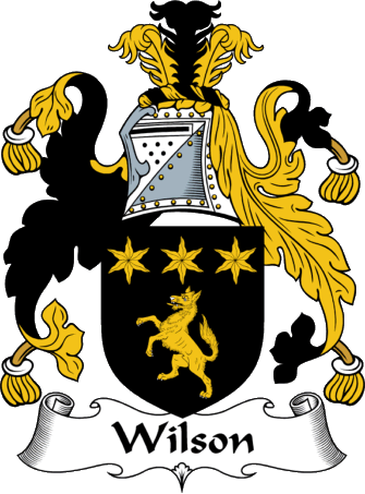
And then there's this one:

Look familiar? Remember these from last week's post?

As
far as I can tell, the only difference between these two designs is
the shape of the stars: The one on the Castle uses five-pointed
mullets,
while the one on the Matterhorn uses six-pointed estoiles.
But anyone unfamiliar with heraldic terminology would probably use
“stars” to describe either version—I cannot shake the
impression that both are intended to represent the same coat of arms.
And sure enough...both
versions
can be found among the many coats of arms associated with the surname
Wilson.
So did anyone named Moss or Wilson work on the Matterhorn during the
right period to influence the design of the gates? Maybe? I don't
have access to WDI's personnel records, but both of them are common
enough surnames that it's certainly plausible.
But either way, we've been hanging around listening to this yodel
music long enough. It's time to visit the last major stop on our
heraldic tour of Fantasyland. Actually, we'll be backtracking all the
way to Sleeping Beauty Castle and beyond, because we're headed for
Fantasy Faire!
Befitting its Princess-heavy theming, Fantasy Faire is chock-a-block
with heraldic imagery. As you enter from the Hub, look across and up
at the steeple-like structure to see this coat of arms perched above
a Gothic arch:

It's not especially authentic, but I like it for what it represents.
The letters CPG stand for Carnation Plaza Gardens, the dance venue
that used to be in this location before Fantasy Faire was built. The
flowers under the letters are, of course, carnations.
Running underneath the steeple is the corridor to Frontierland, which
passes between the exit of the Royal Hall and the shop, Fairy Tale
Treasures. The beams here are lined with some amazing-looking
shields:

The
arms displayed here are gorgeous in their simplicity. The shields
themselves look substantial and functional...unlike others we'll see
in a few minutes that are clearly fanciful. The inverted-teardrop
shape of three of them is common in Italian heraldry, perhaps
implying a Pinocchio
connection that would go with the animatronic Figaro on a nearby
balcony.
This
corridor also contains a number of banners with more-or-less heraldic
designs on them:

To
me, these look very modern and not especially authentic. The colors
are too “designer,” etc. But there are a couple of things I want
to point out. Firstly, the shapes of these banners are two variations
on the gonfalon,
a type of heraldic banner which, like the teardrop shield, was at its
most popular in Italy. Secondly, take note of the banner at right
rear with the image of a crown. The orange and teal color scheme is
completely hideous, of course, and would never be used on an actual
coat of arms, but this design is an example of counterchanging,
or swapping the colors of the field and charge on either side of a
dividing line. When used with better colors, the effects are quite
striking and attractive.
Now
let's head over and walk around the Royal Theatre, which has these at
intervals around its perimeter:

Guys,
I don't think King Triton or Prince Philip perform here...
These
are obviously not serious attempts at heraldry. More like vague
suggestions of heraldry with a very
feminine slant, as if we've wandered into an alternate universe where
the Disney Princess franchise has existed since the 1100s. A more
traditionally shaped but but just as whimsically designed coat of
arms can be found inside, over the stage:

You
don't have to be well-versed in symbology to figure out what this
design is trying to say. Drama masks, a rose, and the seven-rayed sun
emblem of the kingdom of Corona. (Although for the past several
months, it's been lying,
as the Tangled and
Beauty and the Beast
shows have been pre-empted by all Frozen,
all the time.)
The
Royal Theatre is at the low end of the heraldic authenticity scale, I
guess is what I'm saying.
And
that's about it as far as conspicuous displays of heraldry in
Fantasyland. But there are still a couple of less obvious ones I want
to highlight. First there's this interesting triptych inside the
Enchanted Chamber (the shop on the west side of the Castle arch):

By
this point in your education, your guess is as good as mine as to
what any of these signify. The coat of arms on the far right is
similar to that of the earliest Counts of Hainaut—the rulers of a
region in the Holy Roman Empire that is now part of Belgium...but
what, if anything, that has to do with Disneyland or Sleeping Beauty
Castle, I have no idea. What I find the most fascinating about these
is how old they look.
The muted colors, outsized crests, assymetrical mantling, and other
quirks speak to a very early period of heraldry, before all the rules
had been set in place and before the artistic aspect of the noble
science had evolved much.
The
very last stop on our tour lies at the opposite end of Fantasyland
from the Castle—much farther than we have yet wandered.
(Sorry-not-sorry for the circuitous route...it turned out to be most
natural way to present the information I had collected.) This
armorial achievement appears on the back of the sound booth in the
Fantasyland Theatre:

Those
holly sprigs might look Christmasy to modern eyes, but this design is
not, as you might suspect, a relic of the Mickey's Nutcracker show
way back in the Nineties. I would lay odds on this being painted when
the Theatre was temporarily converted to the Princess Fantasy Faire,
or maybe for the Snow White show a couple year prior. So what is
going on here?
This
may be the clearest case we have of an Imagineer leaving their mark
on Disneyland via heraldry. This coat of arms—three clusters of
holly leaves—belongs to Clan
Irvine of Drum in the Scottish lowlands. Irvine.
There's a name that will be familiar to admirers of the Imagineers.
Disney Legend Richard “Dick” Irvine may have left this world
behind in 1976, but his daughter-in-law Kim Irvine is currently the
Art Director of Disneyland, and I would wager actual money that she
was behind this addition to the Theatre.
And
thus we find ourselves, inevitably, at the end of our journey. I hope
you've found all this interesting, and maybe even been inspired to
learn more about heraldry on your own. Obviously, a pair of blog
posts about one section of a theme park can barely scratch the
surface of such a vast subject. I honestly haven't even covered all
of the heraldic designs to be found in Fantasyland...just the ones
that stand out to me, for one reason or another. I encourage you to
explore the next time you're at Disneyland, and see what you can
find!
* “Charge” is a catch-all term for anything in a coat of arms
that isn't mere background. Even the bold stripes that make up the
most basic heraldic designs are charges: the “honorable
ordinaries.”
** Perusing that page, you'll notice that each canton uses the same
design for its coat of arms as for its (square) flag...with a few
exceptions. Ticino and Lucerne both divide their flag horizontally
and their coat of arms vertically...but the corresponding shields on
the Matterhorn chalet are divided horizontally. Presumably the error
came about because the attraction designer only had access to the
flag designs and didn't realize there were any exceptions to the
usual practice. Perhaps a future refurbishment will correct the
mistake.
No comments:
Post a Comment